Let’s Talk.
Want to grow fast? Let’s talk.

"*" indicates required fields

Apply Now.
Please apply below.

"*" indicates required fields

Hidden
Drop files here or
Max. file size: 300 MB.
    All
    Paid Media
    Google

    Calculate How Your Marketing Spend Scales In Google Sheets

    Mar 29, 2021 |
    Written by:
    Alex Eisenhart
    Why Scaling Marketing Spend Is Hard

    All marketers who have scaled up their activity have faced decreasing marginal returns on increasing advertising spend, with cost per purchase rising or return on ad spend (ROAS) decreasing.

    We have all been there – performance is good, so we turn up the spend – but then our ROAS gets worse and then the debate begins on whether to cut right back again.

    It’s time to get a grip on how performance reacts to scaling, understand what may happen in advance and be able to put plans in place to cater for it.

    We’ve created a Google Sheet to demonstrate how to use the forecast() function and the filter() function to create a dynamic statistical model to give insight into whether performance has improved from one time period to another.

    Put simply, we want to be able to assess if our marketing is getting more effective, whilst taking the effect of volume on results “out of the equation”.

    Read on for a step-by-step guide on how to do it yourself (the link to the template sheet is at the bottom of the article).

    How To Build A Statistical Model In Google Sheets

    We will start with a quick 101 in using linear regression in google sheets, and then apply that technique to visualise whether marketing spend is scaling effectively.

    Our Dataset

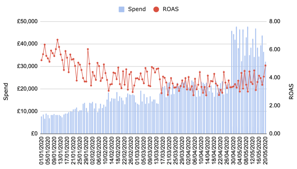
    So, let’s explore some fake advertising data generated by some formulas in google sheets. We have daily spend, revenue and ROAS in our base table.

    In our imaginary example, the company is spending ever increasing amounts on marketing, and ROAS is falling:

    roas spend graph

    Although we can spot fairly easily where performance improved, this simple example serves us well in exploring the technique.

    Linear Regression Basics

    Linear regression is a technique where we explore how a predictor (x) is correlated to an outcome (y), whereby a “line of best fit” is drawn through the data in order to make predictions.

    I will try to explain everything in layman’s terms, but there are loads of resources on the internet that you can read to get a deeper insight into regressions.

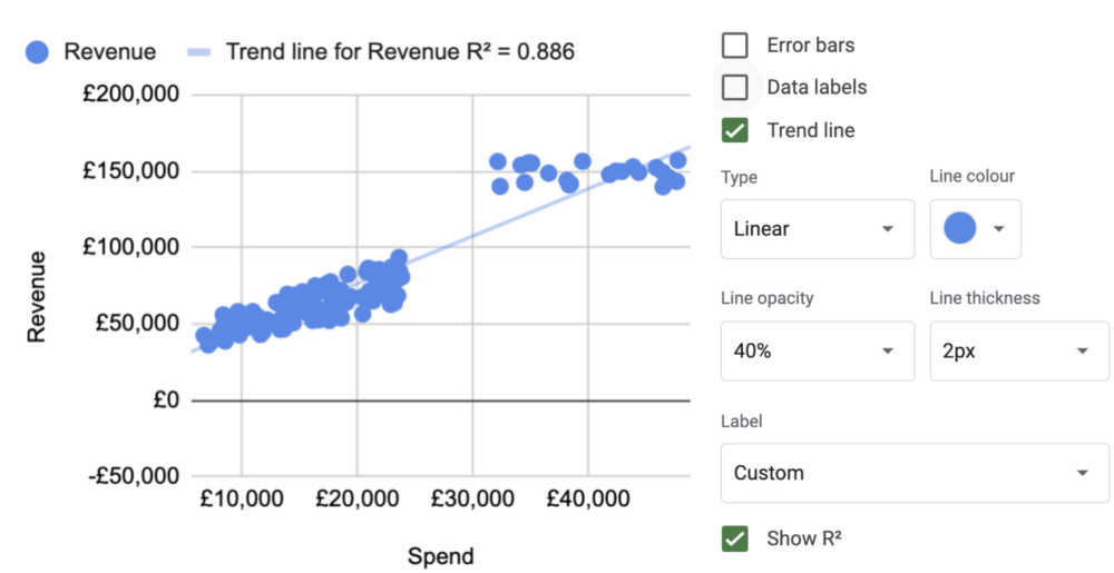
    We start by making a scatter plot of spend (our x) and revenue (our y). In google sheets, we can go to the settings of our chart and ask for a linear trend line and the r squared to be displayed:

    revenue trend line

    The r squared tells us how well the line fits our data. Put another way: it tells us how much variance there is in values around our line of best fit.

    • If r squared were 1, then all points would sit on a line of best fit.
  • If r squared were 0, then we would essentially have a circular cloud.
  • The line of best fit we have generated gives us an estimate of the revenue we may expect from a given spend when looking at all the data in our dataset.

    We can see a strong r squared here (less than .6 is quite weak, less than .5 is usually unwise to use – but always judge based on your experience of reality – context is everything).

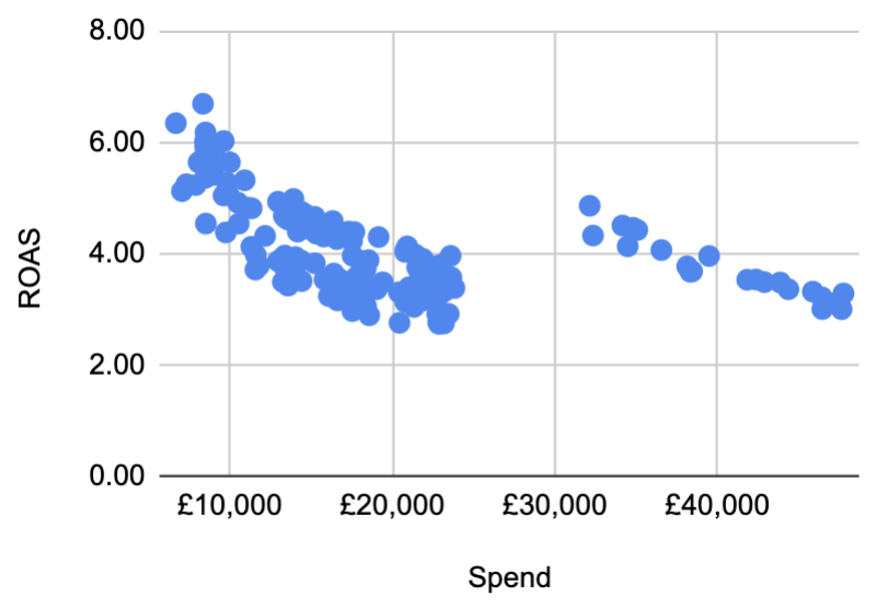
    If we plot spend and ROAS – we can really see how increased spend has brought with it a drop in performance:

    spend roas graph
    Model one time period, then apply its predictions to another.

    The situation we are in now is that we recently increased spend substantially, and we want to understand the marginal value.

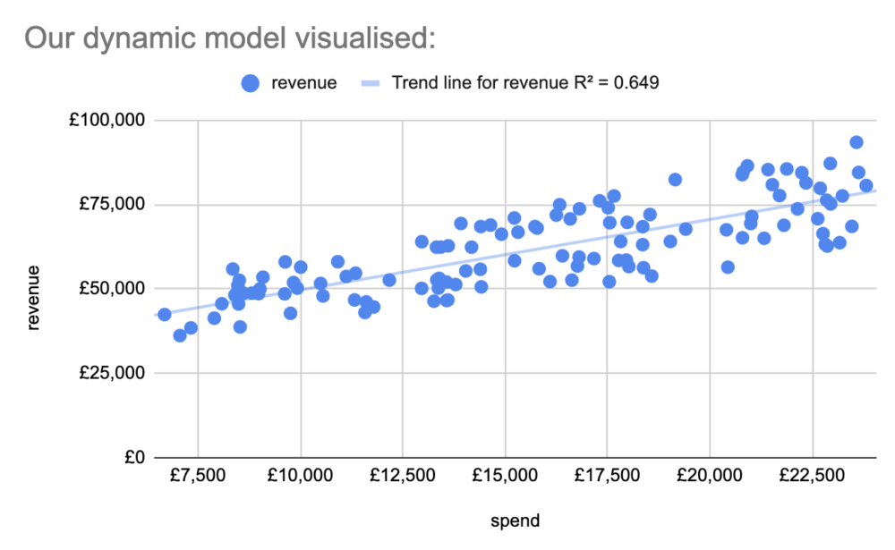
    Using the filter() function in gsheets – we can make a separate table, and filter the spend and revenue data by date. If we filter to include only the time period before the push in budget, we can build a model of that time period before that change and map out the predictions that model gives to the period after.

    Our scatterplot of that time period, with a linear model visualised looks like this:

    revenue trend line

    Now this is where the forecast() function comes in. This nifty formula calculates a line of best fit and spits out the expected outcome for a given predictor in one go. It works like this:

    =forecast(‘the input for which we want a predicted outcome to be generated’, ‘the array of example outcome data (revenue)’, ‘the array of example input predictor data (spend)’).

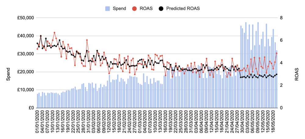
    We use this formula to make a new column of data in our original dataset, based on the filtered data from before the big spend increase. We can then show the output against actual results:

    spend roas and predicted roas graph

    In the period we based our model on, we can see that ROAS is quite accurately predicted. In the period after, ROAS consistently exceeds what our model from the period before predicted! Something has happened to improve marketing efficiency at scale.

    Explore it for yourself

    Feel free to copy our google sheet and inspect the formulas to reverse engineer and build your own similar tool.

    Try entering some text in an unused cell – each time an edit is made the numbers change since the spends and revenue are subject to randomness – each time the data looks slightly different, but the conclusions remain the same. For this reason the numbers you see in this post may be different to what is in the sheet.

    Attribution Modelling and Budget Planning

    We can take this further to include more predictors, allowing us to build more insightful models to help answer questions around attribution and budget planning.

    Using a multiple linear regression model we can bake in more factors that affect performance such as discounted revenue from offers, demand trends or weekday effects.

    By doing this on the top line revenue from all marketing spend we can often build a solid expectation of revenue based on budgets and other known, measurable levers (i.e. discounts, seasonality).

    Having this knowledge is extremely powerful. Want to know if branching out into a new marketing channel is effective? When we spend more, and into that new channel – does our revenue start to exceed our previous expectations, all other things considered? Planning a discount offer? Know how much to spend to achieve a ROAS that is still profitable.

    This type of analysis bypasses problematic measurement from ad platforms and website session data, leaving us with a robust tool to assess whether we are making progress!

    Join the BARK newsletter.

    Join 1,000+ other DTC brands and receive a short email every week or two to give you insights, ideas and actions you can take to grow your business.

    "*" indicates required fields